So as digitalization increases, the requirement for business websites is rising. There are around 1.7 billion websites present on the web. One can estimate how difficult it is to rank well on the search engines and get mass reach on the website. Usually, businesses think that making a website, promoting daily on other digital platforms, and taking care of the basic SEO will help them get a good rank but, that is not true! There are several pain points of the website that shape its structure. The basic thing one has to take care of is website design. It is a critical part of the website structure. Just a few web design mistakes can put all effort into vain.
Signs Of A Bad Website
If you find any of the following situations with your website, that means it is an alarm that you have a bad website design, and you may need to consider a website redesign.
1) Slow Website Loading Speed
According to Google SEO policies, the ideal speed of the websites must be within 3 seconds. If it’s not the case, you must check the reason behind the lagging. It could be a specific design element or unoptimised media that makes it hard for the website to load faster.

Also, if your website will lag a lot, then the user may not wait for long. Resulting in an increased bounce rate (visitor leaving without viewing a second page) followed by a lower search engine rank.
2) Wretched Layout/ Bad Website Design
Your website needs to be self-understood. So when the visitors land on the website, they should get an idea of what they have to do.
– The landing page should be attractive
– Self-explanatory content
– Optimised media
Still, if you face the challenges of retaining the visitor, you need a different website redesign strategy.
3) Non-Responsive Website
Responsive websites are preferred by search engines and admired by users.
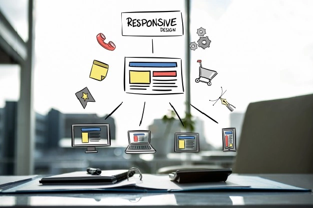
Responsive websites adjust their layout automatically according to the device screen. If your website is hard to navigate on any device type, the user may leave the website immediately.

4) Hard To Understand Content
People usually think lavish and fancy language will be valued more than general writing. Undoubtedly, creative writing is important but it should be easy to understand so that your website sounds welcoming and approachable. However, your content style must compliment your target audience too. If you are targeting high society educated citizens, you may go for more sophisticated language than easy to understand.
Moreover, the content should be updated regularly. Your website must tell about everything one should know in case they would have visited your office.
5) Prominent Social Media Buttons
People are always interested in business social media. If you put the social media directing buttons on the top or prominently somewhere, the visitor will lose interest in the website information and get redirected to the social media.

To eradicate this situation, one should put the social media buttons at the bottom, or on the sides, or anywhere they are not really highlighted.
6) Lack Of Readability (inappropriate font/size/colours)
Most often, designers think cursive fonts will look more attractive whereas, it could be the reason people are not visiting your website. Designing is important, but the focus should be on sharing the right message in a readable manner.
If your visitors are unable to read the information, or not able to understand the font style, or the font colour is not visible. The visitor will get disappointed and leave the website.
7) Absence Of SSL Certificate
If your website doesn’t have the “valid SSL certificate” or in simple language, it doesn’t have “HTTPS” the visitor may get the browser warning that your website is not safe to visit. Consequently, you can lose the maximum number of visitors.

HTTPS encrypts the information between the website and the users, and it is safer in the eyes of search engines and web browsers.
SSL certificate works as an advantage when it comes to SEO.
8) Missed Call To Action (CTA)
When you made the website design you must have had some goals, right? For instance, newsletter subscription, lead generation, getting a call from the customer, etc.
Since you have made the goals, you must be the one who knows what you are expecting from the visitor. It will be conveyed to the visitor by adding a call to action on the webpage.
CTA works as an instruction for the visitor to act in a desired manner.
9) So Many Advertisements On The Landing Page
It usually happens with blogging websites. Imagine a landing page filled with ads, and it is hard to see the website’s own content. There are such websites; none of us likes those websites. Make sure your website is not looking like a spam website. Otherwise, you will lose the visitors and brand authenticity as well.

10) Conventional Captcha(s)
People avoid visiting websites due to the presence of captcha(s). They are so hard to be solved even by humans, leading to loss of visitors, purchase and other desired acts of the visitor.
Alternatively, you can check what all captcha substitutes are available in the market, so you don’t lose the visitors and the business.
In The End…
If the above points make you feel you have to relook into your website, redesign a website to get rid of a bad website design. Moreover, it takes a lot of time in development so, it is better to plan a strategy first and then share the design with the developer. Also, do not forget to consider SEO and analysis readings while building a strategy. For more suggestions, do not forget to subscribe to our newsletter.
