
The first thing we do when we need something looks it up online. Because of this, many marketing professionals assert that if your company doesn’t have an online presence, it’s as though it doesn’t even exist. However, there is something even worse than not having a presence online.
It’s having a website with poor user experience due to poor website design. A seamless customer journey that immediately attends to the needs of potential customers and gives them pertinent answers to their inquiries is the secret to a successful business. This is where enhancing UX is important.
What Is User Experience (UX)?
According to Don Norman, who coined “User Experience,” UX includes all aspects of a user’s interaction with a product. What is he trying to say here? It implies that user experience (UX) encompasses the user’s understanding of a product and their knowledge before and after using it. Therefore, more than creating a user-friendly and appealing interface is required. Additionally, it concerns the experience that the product communicates through its advertising, packaging, delivery, follow-up services, etc. A UX designer must continuously consider the needs of users throughout this entire process.
A design would only matter how good it was if that did happen. UX design services need to strike the right balance between usability, usefulness, and desirability to enhance the user experience on the website. To that end, we define good UX, discuss its significance, provide a list of ways you can improve your User Experience to generate more revenue, and explain why we should constantly consider usability and user experience.

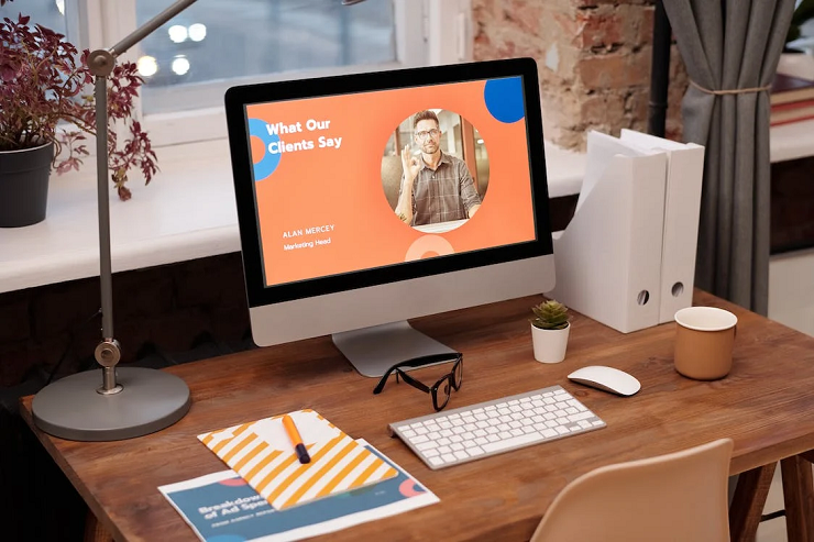
1. Information Should Be Prioritised
One of the most challenging components of creating the ideal user experience is effectively prioritizing information. The user is likelier to remember the message you want them to take away if you give them the most crucial information and then reiterate it near the end. The user’s attention is drawn in by a strong beginning and conclusion. Additionally, it ensures that the message is permanently imprinted in the user’s memory.
2. The Faster, The Better
Every second counts when it comes to webpage load times! The ideal loading time is between one and two seconds. The highest conversion rates occur then. The bounce rate rises when a website takes longer than three seconds to load. At 2 seconds, the rate is 9%; at 5 seconds, it soars to 38%. Most users have a purpose in mind and are impatient. Therefore, it is crucial to optimize website loading time to satisfy them.
3. Use Shapes And Colours Smartly
Artists know the enormous influence that shapes and colors have on how people perceive almost anything on earth. Well, marketers also do. When creating a website, it’s essential to express the brand’s essence elegantly through colors, shapes, and patterns. Consider Dr. Doofenshmirtz from Phineas and Ferb to help you understand. He had a triangle-shaped face because “triangles” are frequently linked to negative, imposing, and defiant emotions. Contrarily, circles and other shapes without edges are seen as trustworthy and amiable. The same is true of how light and dark colors influence how a person perceives a particular brand or website. By effectively utilizing them, you can keep users’ attention for a more extended period and advance the objectives of your website.
4. Conventions Are Your Allies
Conventions evoke a sense of familiarity in us like a familiar friend. Additionally, user engagement is held by websites’ standard designs. This is not to say that you shouldn’t incorporate cutting-edge UX design trends into your design; it just means that innovation shouldn’t be sacrificed in favor of benefits provided by the convention. Even on their first visit, users are drawn to a website by standard conventions like the placement of the logo in the upper left corner, the contact information in the footer, the primary navigation menu at the top, etc.
5. Make Sure Your Website Is Responsive And Simple
Remove any extraneous elements from your website’s design. This is crucial because no visitor would want to search through a maze to find what they’re looking for. Make sure there is plenty of white space and a clean layout. It is also thought that a two- or three-color scheme is best.
Additionally, each of your pages ought to have specific objectives. Each page’s intention ought to be precise. To better direct your visitors, it would be a good idea to have visually distinct navigational elements on your user interface. You should place additional, less important information at the bottom of your posts, such as a blogroll or content that “you might also like.”
6. Put Your Call-To-Action In A Container
Put essential components, like your call to action, in a container to make them stand out. If your call-to-action was a circle, for example, enclose it in another loop to set it apart from the other elements on the page. Ensure site visitors can quickly and easily understand what you want them to do. You can also perform the squint test to determine whether your call-to-action button stands out.

7. Improve Your Headlines
Users can preview the content below a headline by reading the headline itself. Well-crafted headlines serve as guides for users, guiding them quickly and effortlessly to their desired destinations. Your headlines should be audience-focused, communicate your message clearly, and draw people in. Use keywords where possible in your headlines to increase SEO rankings and make it easier for potential customers to find you.
8. 404 Errors Are Not Acceptable
Consider clicking and expecting to be redirected to a page where you can perform a task, only to be met with a “Page Not Found” message. What a hassle that would be! Users are irritated by 404 errors, which obstruct their website navigation. It significantly degrades the user experience. Therefore, if you want to enhance the user experience on your website, fix your 404 errors. To do this and prevent your users from ending up at dead ends, you can use tools like Google Webmaster.
In A Crux
The ultimate objective is to add value for website visitors. These 8 suggestions will assist you in enhancing the user experience on a website and optimizing your design to meet user requirements. You can give your website visitors the best experience if everything is in proportion. A positive user experience benefits both your company and its customers.